What Makes A Great Infographic

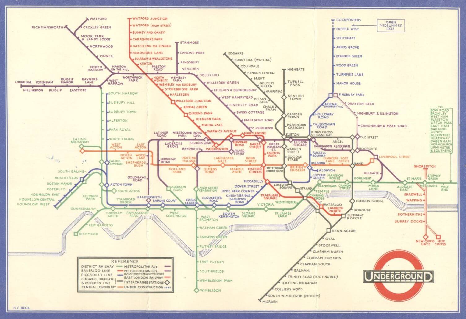
This year has seen an explosion of infographics, and while they have been around for decades in their current form (at least with regards to illustrated/2D visualizations) and centuries in some form or another, this has been the first year where they have been widely popular on social news sites as a fine addition to the typical arsenal of text/photo/video for content creators to utilize to convey information in a more interesting and digestible way, and to get more exposure to their site in the process.
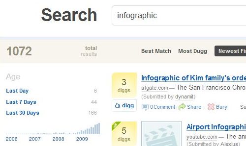
A quick search of Digg.com stories shows the increased usage in the titles of submissions:

Through the creation of many successful infographics, and a few that have tanked, we understand that there is still much to be learned of course, but have also picked up some best practices. By adding designers to our team with decades of experience in print infographics, we also have the benefit of remembering that a fundamental purpose of each piece is to make a complex or boring set of data understandable and interesting by highlighting that which is important. Further, we have always enjoyed the fact that experimentation is still fun and necessary, and in our particular practice of creating a graphic and getting it as much exposure as possible, we are constantly given fresh feedback on which aspects and methods are preferred from people of all ages from around the world who all interpret the message through their own worldviews.
First, at the foundation of our piece, we have solid data. One of our favorite things to do is to work with clients who have proprietary data, as that gives us a unique angle and a fresh source of current statistics. If we have a great idea, but the data isn't fresh or credible, then it's best to either table it for later or pursue proprietary data to fill in the gap.
Next comes the question of what to do with that data, and what a good infographic/data visualization does and looks like…this is where the artistic side of the information designer has a chance to shine. Of course you will have inspiration in the back of your mind from stuff that you have seen that you like, but it is best to continually draw from other unconventional resources as well. As much as there are fundamental and appropriate methods to use, there is no reason to just do what everyone else doing.
There was a great thread started by Nathan Yau at Flowing Data in October called "What the **** is Visualization Anyways?" that drew in some great answers from the robust community over there. The first commenter, Christian, gives us a pretty useful standard, saying "(Information) Visualization is an umbrella term for any translation of a set of abstract information into a visual representation with the objective of increasing insight into this information."
Some of the most visually stunning and complex pieces have had holes shot through them by commenters who immediately dismiss it as needlessly confusing. Or perhaps the piece is very aesthetically pleasing (to us of course, since the artistic aspect is always subjective) but the data isn't labeled with the level of detail that one person might prefer, say in the case of a piece that is showing a ratio relationship. We ultimately just take the feedback and strive towards that hybrid goal of making our infographics visually pleasing and artistic without drawing away from or distracting people from the (usually most important) goal of making complex data more interesting and easily understood.
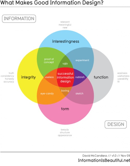
David McCandless posted a pretty cool and useful venn diagram at Information is Beautiful called What Makes Good Information Design? that gives a good perspective on some of the necessary ingredients for a universally loved piece: interesting, easy, beautiful and true (click image below to view full size on his site).

As Steve Duenes of the New York Times said in a Talk to the Newsroom Q&A awhile back:
Our criteria for what makes a great graphic varies a little. There are things we attempt, and we hope the result will be spectacular, but we also think there's such a thing as daily graphic excellence. It doesn't do us much good to produce a few splashy graphics but stumble on the smaller, routine things. If a reader can glance at a map or simple chart and quickly orient themselves or understand a statistic, and then continue reading the story without skipping a beat, it means we've edited and designed those graphics well.
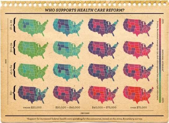
As you can see, their team consistently compliments the news with beautiful, functional and informative graphics that can tell the story on their own, but are presented in line with the editorial analysis of any given topic, which is a nice homage to their newspaper roots.

That said, we have come to a fairly standard, crowd-informed test of the success of each of our infographics. Beyond the obvious and nice-to-hear comments combined with the quantifiable measures of the reach/traffic of the piece, we feel like an infographic has served its purpose when we find people discussing the topic of the piece and the data itself. This perfect condition is difficult to achieve when experimenting with new formats that are not immediately understood, but that is where the art of the process comes in, and as long as the data itself isn't manipulated or malformed for the purpose of being more visually pleasing, there is typically no harm done (except in cases where ultra-hot pink permanently damages a viewer's eyes).
Need help creating powerful infographics? LET'S CHAT.

What Makes A Great Infographic
Source: https://www.columnfivemedia.com/makes-good-infographic/
Posted by: jonesmucconothave.blogspot.com

0 Response to "What Makes A Great Infographic"
Post a Comment